

chapter 8
Production
Now we will take a closer look at the production process because it is here that we can examine the main tools for implementing a multimedia story.
Imagine that fieldwork is complete, and you have collected all the material according to the developed concept. You are now ready to proceed to the active phase of product development.
At the production stage, you will encounter five main phases of work. They do not necessarily need to follow one another in the sequence outlined below. It is also worth noting that they can occur simultaneously or repeat several cycles.
PRODUCTION PHASES:
1
Form:
сhoosing the product type, material breakdown, structure.
2
Prototype
navigation, logic, experience time.
3
Visual сoncept and composition.
4
Editing and adapting materials.
5
Layout/assembly and finalization:
proofreading, debugging, team roles.
1
Form:
сhoosing the product type, material breakdown, structure.
2
Prototype
navigation, logic, experience time.
3
Visual сoncept and composition.
4
Editing and adapting materials.
5
Layout/assembly and finalization:
proofreading, debugging, team roles.
1/ Form
PRODUCT type
The product type should, of course, be considered at the concept stage, but this choice is also influenced by two factors:
1
AUDIENCE
What are their media consumption habits?
Through which channel and on what device are we communicating with them?
Through which channel and on what device are we communicating with them?
2
SPECIFIC CONTENT DETAILS
What types of content do we have, in what format, quality, and amount?
- EXAMPLE 1:
PRODUCT: interactive mobile app.
- EXAMPLE 2:
PRODUCT: podcast.
MATERIAL EXAMINATION
After collecting content, it is crucial to bring all the materials into an organized system. This will make it much easier to organize team work, find the necessary content segments, and edit them.
Distribute all material types into corresponding folders with intuitively understandable names so that all team members have access and can see the overall picture.
Distribute all material types into corresponding folders with intuitively understandable names so that all team members have access and can see the overall picture.
STRUCTURE
Structure is the development of the storyboard stage and represents the overall narrative logic—the sequence of key messages through which we guide the viewer from the entry point to the exit point. It is best to write down the main messages and key points of the story on paper, lay them out on a table, and with the team create several assembly options.
At this stage, you get a diagram consisting of conceptual building blocks.
These building blocks can then be expressed in any type of media (text, sound, video, photography, archival document, etc.). How exactly to express each block—with a sound track or a photograph—is determined by the author’s intention and the specifics of the collected material. Structure is like a Christmas tree, on which we hang content episodes, i.e., fragments of different media types collected during fieldwork.
WIREFRAME
1
MODEL
How is the material distributed across screens, chapters, and blocks? Do we have one page with a long vertical scroll, or do we have five chapters, each on its own page, and a map that opens in a separate window, with 24 subjects’ stories accessible from it?
2
NAVIGATION
How are transitions between blocks organized, and what navigation elements are used — buttons, arrows, menu items, etc.?
3
USER SCENARIOS
All possible routes the viewer can take, how and where they can go from each point in the project.

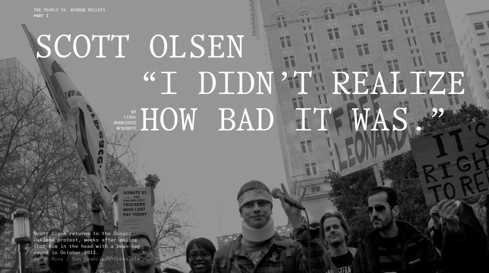
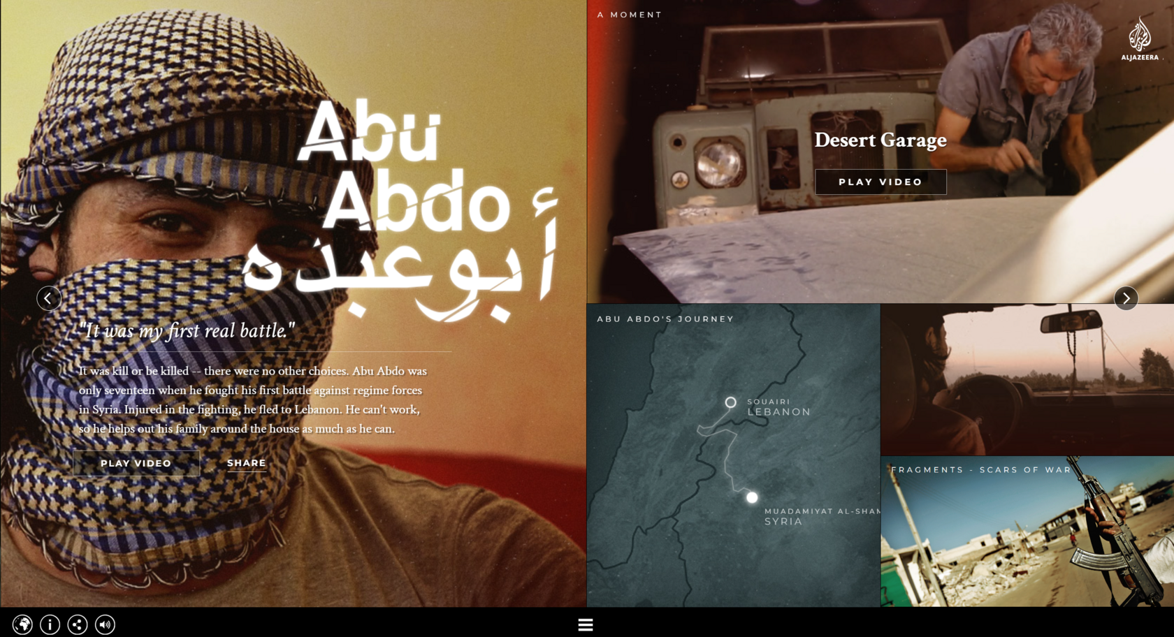
The project The DJ and the War Crimes raises questions about why many of the war crimes committed during the Yugoslav conflict remain uninvestigated and unpunished. The project team conducts deep research using various materials to identify the personality of one of the war criminals, known for playing music at parties in Europe decades after the conflict.
Apart from the possibility of linear viewing, the user can delve deeper into the narrative, exploring the extensive documentary archive of collected materials.
Apart from the possibility of linear viewing, the user can delve deeper into the narrative, exploring the extensive documentary archive of collected materials.
2/ Prototype
A prototype is a schematic view of the project or part of it, implemented using technological solutions similar or identical to the final ones. A prototype allows you to test the viability of decisions made at previous stages. It helps evaluate the amount of text, image sizes, the placement and content of navigation elements, etc. In short, a prototype helps test the effectiveness of the project and its compliance with the conceptual design at a stage when it is still possible to make adjustments without difficulty.
Testing the prototype allows you to verify how user-friendly and functional the product is and whether it achieves the set goals—leading the viewer to the planned effects.
Experience Time — the time required to achieve the planned experience.
Testing the prototype allows you to verify how user-friendly and functional the product is and whether it achieves the set goals—leading the viewer to the planned effects.
Experience Time — the time required to achieve the planned experience.
3/ Visual Concept and Composition
Composition is developed in two interconnected directions — logic and aesthetics.
1
LOGIC
All elements of the composition are organized in such a way that, when looking at them, we move from the general to the specific, from the more important to the less important. These semantic priorities are dictated to us by the structure and logic of our content.
2
AESTHETICS
All elements on the screen form harmonious combinations in terms of form, color, typography, i.e., the anatomy of visual communication.
(Typography is a system of principles forming the approach to text presentation—font type, style, layout, etc.)
(Typography is a system of principles forming the approach to text presentation—font type, style, layout, etc.)

In the project Colors of the 1944 Uprising, the authors selected 100 black-and-white archival photographs of the Warsaw Uprising and transformed them into color images. This move is not an example of empty aestheticization but rather a way to bring the events closer to the modern viewer through the greater realism of the material and the intentional departure from the format of black-and-white photography, which by default is perceived as something distant and historical.
LEVELS OF INFORMATION
1
TEXTUAL
Distribute all content units into levels: quotes, titles, author’s text, footnotes, supplementary elements. Working with information levels sets the general types of content blocks and helps the viewer navigate the project, linking various layers of multimedia narrative into a unified story.
2
VISUAL
Assign each visual content unit a specific place in the viewer’s perception. Large and small-sized images, additional graphics, or other accents help create the necessary rhythm in the composition of screens.

The project The Space We Hold tells the stories of three elderly women from different Asian countries, some of the 200,000 girls who experienced violence during World War II. Knowing that their lives are coming to an end, they speak about their sexual enslavement in their youth for the first time. To listen to each story, the user must continuously hold the "spacebar." This seemingly insignificant interactive element intensifies the complexity of addressing such a personal and difficult topic as sexual violence and demonstrates the viewer's engagement and presence using the keyboard.
At any moment, you can stop and leave, and the program will generate statistics on how many people left this story and why (the user can leave feedback): “I did not want to hear that she continues to live after such an experience.”
At any moment, you can stop and leave, and the program will generate statistics on how many people left this story and why (the user can leave feedback): “I did not want to hear that she continues to live after such an experience.”
THE AXIOMS OF FORMAL THEORY
OF COMPOSITION
OF COMPOSITION
The rules of working with visual aesthetics are reflected in the so-called formal theory of composition, which defines the scenario for perceiving all visible elements, regardless of what these elements represent or mean. The axioms are presented in order from general to specific. They are usually considered separately but work together.
1. Level-based perception of composition.
2. Grouping composition elements by common attributes.
3. Order of attention shifts.
4. Relationship between placement and meaning.
5. Attention fixation on composition centers.
6. Attention shift along known parameters and directions.
7. Change of attention shift order in different cultural contexts.
1. LEVEL-BASED PERCEPTION OF COMPOSITION.
From a compositional point of view, there are levels (steps) defined by physical scale. Perception occurs
in a stepwise manner — from macro to micro, from larger to smaller. The human visual system is not capable of simultaneously perceiving elements belonging to different levels of composition clearly. Moreover, even within a single compositional level, the clear perception of elements is limited to a range of 5 to 9 units — anything beyond this range is perceived as chaos.
Composition Levels:
A good composition always has several levels within the format of the product's existence and allows the viewer to sequentially shift their attention.
From a compositional point of view, there are levels (steps) defined by physical scale. Perception occurs
in a stepwise manner — from macro to micro, from larger to smaller. The human visual system is not capable of simultaneously perceiving elements belonging to different levels of composition clearly. Moreover, even within a single compositional level, the clear perception of elements is limited to a range of 5 to 9 units — anything beyond this range is perceived as chaos.
Composition Levels:
- Landscape details, city blocks (0.1–1 km).
- Buildings, structures (10–100 m).
- Small architectural forms, outdoor advertising (1–10 m).
- Instrument panels, book format, screen details, interior elements (0.1–1 m).
- Composition details, illustrations (1–15 cm).
- Letter elements (1–10 mm).
- Texture elements (0.1–1 mm).
A good composition always has several levels within the format of the product's existence and allows the viewer to sequentially shift their attention.
2. GROUPING COMPOSITION ELEMENTS
BY COMMON ATTRIBUTES.
The human visual system can group separate elements of a composition based on the following principles:
Such grouping of elements reduces the load on one compositional level, translating the group to another. For example, the use of a grid organizes a large amount of information into a hierarchy that is easy to read. Such an approach has long been used in the layout of multi-page publications.
BY COMMON ATTRIBUTES.
The human visual system can group separate elements of a composition based on the following principles:
- By size.
- By shape.
- By color.
- By placement.
- By orientation.
- By the “goodness” of shapes.
Such grouping of elements reduces the load on one compositional level, translating the group to another. For example, the use of a grid organizes a large amount of information into a hierarchy that is easy to read. Such an approach has long been used in the layout of multi-page publications.
3. ORDER OF ATTENTION SHIFTS.
A person’s attention shifts from elements with greater mass to those with less mass. The mass of an element is determined not only by its size but also by the density (color and texture) of its filling. An element with the greatest mass defines the entry point into the composition.
A person’s attention shifts from elements with greater mass to those with less mass. The mass of an element is determined not only by its size but also by the density (color and texture) of its filling. An element with the greatest mass defines the entry point into the composition.
4. RELATIONSHIP BETWEEN PLACEMENT AND MEANING
There can be a relationship between the placement of elements and their meaning:
There can be a relationship between the placement of elements and their meaning:
- Central placement indicates significance.
- Placement at the edge of the screen or page can indicate either secondary importance or an invitation to continue viewing (in the case of sliders).
- Placement in the upper left corner indicates that this element has potential significance (e.g., project or publication logo).
5. ATTENTION FIXATION ON COMPOSITION CENTERS
A person’s attention fixes and moves along a trajectory defined by the composition centers—focal points in the composition. Focal points are, by nature, contrasting to surrounding separate elements or groups. The introduction of contrast among elements is carried out according to the same principles as grouping elements (size, shape, color, placement, orientation, and “goodness” of forms).
A person’s attention fixes and moves along a trajectory defined by the composition centers—focal points in the composition. Focal points are, by nature, contrasting to surrounding separate elements or groups. The introduction of contrast among elements is carried out according to the same principles as grouping elements (size, shape, color, placement, orientation, and “goodness” of forms).

6. ATTENTION SHIFTS ALONG KNOWN PARAMETERS
AND DIRECTIONS
Attention shifts occur along orthogonal directions and away from the observer—into perspective. In particular, we owe this fact to the historical precedent that all known formats for conveying information (scrolls, books, screens, etc.) have a rectangular shape.
AND DIRECTIONS
Attention shifts occur along orthogonal directions and away from the observer—into perspective. In particular, we owe this fact to the historical precedent that all known formats for conveying information (scrolls, books, screens, etc.) have a rectangular shape.
7. CHANGE OF ATTENTION SHIFT ORDER
IN DIFFERENT CULTURAL CONTEXTS
In different cultural contexts, some axioms may have differences. For example, in countries with right-to-left writing systems, one may encounter compositions that seem like mirror images of those from countries with left-to-right writing systems. For example, on many websites in Japan, logos and menus will be located in the upper right corner.
SUMMARY: WHAT MAKES A GOOD COMPOSITION?
- A composition that takes into account the axioms of the formal theory.
- There is an entry point.
- There is an implied trajectory of movement—a flow through which one is “sucked in.” This means that a sequential route through all composition levels must be established, as humans do not “jump” across them.
- The previous point also implies that a composition, apart from an entry point, should have focal points.
- There is dynamics and asymmetry. The most static option for a composition is a symmetrical one.
- Absence of chaos—not in the stylistic sense, but in terms of having an excessively large amount of elements on one compositional level.
- Often, excessive chaos is eliminated by aligning elements but should not lead to the elimination of dynamics.
- Consideration of regional (national, cultural, etc.) specifics of perception.

This project stands out for its truly high-quality design. Each screen demonstrates good composition with 3-4 compositional levels between which the user can sequentially switch their attention.
4/ Editing and adapting materials
When the form of the product is defined, we understand what types and volumes of content we will use to build the narrative. At this stage, it is crucial to rationally allocate the team’s workload: each specialist should be aware of the amount of raw material available and the format of the finalized segments that will be used in the project’s final assembly.
Typically, the editing of materials is divided into five streams, each managed by a separate specialist in the team:
1. Working with texts
2. Working with video
3. Working with audio
4. Working with photographs
5. Working with graphics
In the editing of materials, it is essential to follow the overall narrative concept based on the structure and composition. Often, materials are edited independently of the overarching concept, based on the perceived value of a particular content fragment rather than the coherence and integrity of the entire product. When editing materials and preparing them for the final assembly, focus on the project’s overall result, readability, cohesion, and compactness.
This is especially relevant for text fragments. In multimedia projects, text ceases to be the main narrative element, where sound, images, and video merely illustrate paragraphs. The length of text segments should blend seamlessly into the overall fabric of other content fragments and, together, occupy the viewer’s minimum necessary time while conveying the main messages of the project.
During the material editing stage, it is once again very important to return to ethical principles. Editing, processing, proofreading, and any other forms of modifying the original materials are crucial boundary areas of the project authors’ responsibility. At this point, physical changes are made to texts, images, and audio. These changes alter the contextual integrity and continuity of the documentary narrative and enter the sensitive zone of the authors’ ownership over the private lives of other people. The approach to editing is highly subjective and lies on a fine line between author’s intent and ethics.
WHEN EDITING MATERIALS,
IT IS ESSENTIAL TO CONSIDER
IT IS ESSENTIAL TO CONSIDER
SEVERAL
FILTERS:
FILTERS:
1
Always preserve all materials in their original raw format, working only with copies, to allow for clarification and to avoid irreversible changes.
2
Any modifications to materials should not change their meaning, emotional tone, or authorship.
3
Content fragments should not be taken out of context, as context forms the frame of reference in which the information is perceived by the viewer.
4
Any facts, statements, and data should be verified with reliable sources (fact-checking) and confirmed with them.
5
Any content fragments with even minimal potential for inaccuracy, danger, accusations, or breach of privacy should be additionally agreed upon with the protagonists and other project participants.
5/ Layout/ assembly and finalization
After finalizing and refining the prototype stage, we can begin assembling the entire project, filling the developed structure with content.
The final layout phase brings us as close as possible to the project’s launch and, more than any other stage, is strictly constrained by the publication deadline.
Therefore, it is essential to allocate enough time for final proofreading between the absolutely finished version and the actual publication. This period is often consumed by the rush of last-minute layout tweaks, the editing of additional fragments, editorial changes, or even additional shoots with the protagonist. However, it is crucial to protect this stage, as it ensures the quality of the final product.
Every minor inaccuracy, mistimed sound, or photo that fails to load due to incorrect formatting may seem insignificant. But these issues matter only to the authors, who know how things should be. The project audience, however, is in a completely different relationship with the project — they are still indifferent to it, and every rough spot can disrupt the viewing experience and the impression on the viewer.
AFTER ASSEMBLY AND BEFORE PUBLICATION:
1
TECHNICAL DEBUGGING
Test the product with a few people who are not part of the project team to ensure all navigation elements and transitions are intuitive and work as intended. You must be certain that the viewer does not get confused or feel lost while interacting with the project.
2
PROOFREADING
Submit all text materials to a professional proofreader in a timely manner, as working on grammar, style, and fact-checking can take considerable time and should begin immediately after the content editing stage. After the product is finalized, proofreading should be conducted again: during the layout stage, typos, text loss, and other errors can occur.
3
APPROVAL
Depending on the agreements made with the project’s subjects and partners, show all project materials to participants in advance and get their approval.
Chapter 7
PROJECT STAGES
Chapter 9
PROJECT IMPACT MECHANISM